The difference between an event page that gets views and one that gets registrations is not the design. It is the order of information and the removal of friction.
Most event pages are designed backwards
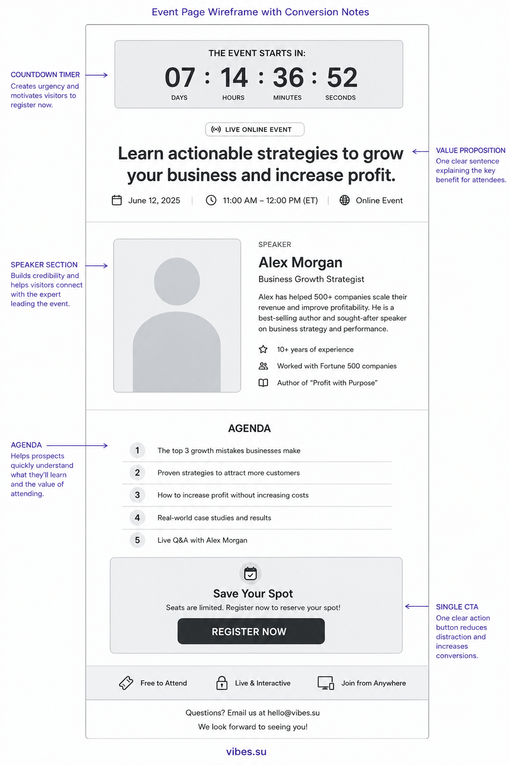
The typical event page starts with a logo, then a hero image, then a paragraph about the company, then the event description, then the agenda, and finally — somewhere below the fold — a registration button. By the time a visitor reaches that button, most have already left.
The structure assumes visitors are patient and curious. They are not. They landed on your page to answer three questions: what is this event, when is it, and how do I get in. Answer those three questions in the first five seconds, or they bounce.
The inverted pyramid for event pages
Journalists use the inverted pyramid: the most important information first, then supporting details, then background. Event pages should do the same.
Top of the page, immediately visible without scrolling:
- event title that describes the outcome, not just the topic;
- date, time, and timezone in large readable text;
- one registration button.
Below that, for those who scroll:
- three bullet points of what attendees will learn or gain;
- speaker or host with one-sentence credibility statement;
- location or platform with a map or link.
Below that, for the detail-oriented:
- full agenda with timings;
- speaker bio;
- FAQ section answering the top five questions.
This structure respects the visitor's attention. The most critical information is immediate. Supporting details are available but do not block the decision.
The countdown timer is not a gimmick
A visible countdown timer increases registrations because it communicates scarcity without manipulation. The event happens on a specific date. That date is approaching. Showing this visually helps visitors understand that delaying the decision means missing the event.
Countdown timers work best when:
- the event is within two weeks — urgency is real;
- the timer shows days and hours, not seconds — seconds feel fake;
- the timer is near the registration button, not hidden in a corner.
Mobile-first because that is where the clicks come from
Event links are shared in messengers, social media, and email. Over 70% of first visits to an event page happen on a phone. If the page requires pinching and zooming, registration rates collapse.
Test your event page on a real phone, not just in browser DevTools:
- can you read the event title without zooming?
- can you tap the registration button with one thumb?
- does the page load in under 3 seconds on cellular data?
If the answer to any of these is no, fix the page before you send any traffic to it.
One button, not three
Event pages often have multiple calls to action: register, add to calendar, share, learn more about the speaker. Each additional button dilutes the primary action. Pick one primary action — registration — and make everything else a secondary link, visually smaller and placed below the main button.
After registration, the confirmation page can include sharing buttons and calendar links. But the main event page should have one job: get the registration.
Use the event page URL everywhere
The event page URL should be the single destination for all promotion. Social media posts, email invitations, messenger forwards, QR codes on physical flyers — all point to the same URL. This centralises analytics and prevents fragmentation.
With a shortened link, you can also track which channels drive registrations. Instagram might send views but email might send conversions. Without per-channel tracking, you are optimising the wrong channel.
After the event: the page lives on
After the event ends, do not delete the page. Update it with:
- a recording or summary of the event;
- photos from the event;
- a signup form for the next event.
The page continues to receive traffic from people who missed the event but found the link later. Converting that residual traffic into subscribers or attendees for the next event turns a one-time asset into a recurring lead generator.